
Only when you see the data can you change the results.
Analytics is a management analytics layer on top of data your production already generates: from shift reporting, from problem and stoppage reports and from takt standards. Nothing is entered by hand. The module reads, aggregates and turns data into OEE, rankings, heatmaps and money. And where numbers stop being enough, AI recurring-problem analytics steps in.
Licensed module · KPI tiles show the calculation basis · the Analytics section also includes AI recurring-problem analytics
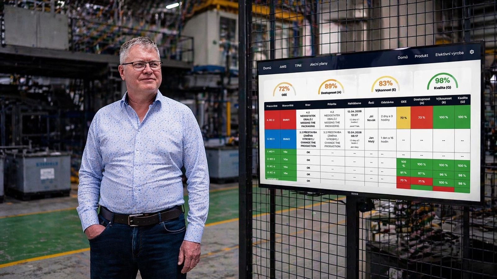
Reports once a month, decisions in the dark
By the time the tally marks from the floor make it into a spreadsheet and through a meeting, the month is over. Nobody reacts to the availability drop from week one anymore.
Production counts parts, maintenance counts breakdowns, quality counts scrap. Three tables, three definitions, three different OEE numbers and endless arguments over whose version is right.
A Pareto shows the biggest loss, everyone nods, and a month later it is back. The link between the finding and a corrective action is missing.
Analytics computes everything from the same records the crew already entered into shifts and reports: one OEE definition for the whole company, a delta against the previous period on every KPI, and a jump from a chart straight into an action plan.
Not prettier charts. Different decisions.
Meetings get shorter
Production, maintenance and quality read the same numbers from the same source. The half hour spent arguing over whose table is right disappears, and you start solving what to do about it.
You fix the most expensive, not the loudest
The order of problems is set by the sum of lost hours and money, not by who walked into the office last. People’s capacity goes where it pays off.
Improvement can be proven
Every number is compared with the previous period and with your target. The effect of a measure shows in the trend, not just in a feeling that things are calm now.
A finding ends in an action
From a problem stoppage, breakdown or scrap reason you open an action plan straight from the chart. Analytics no longer ends in a meeting slide.
What happens when you can see where you lose
"We can identify and address bottlenecks before they become a real problem. Visibility changed everything."
Miroslav Špirko, Head of Production, Tier 1 automotive supplier
Figures are based on iDomino case studies and internal data from production projects, 2020 to 2026.
Analytics does not end at a chart. It leads to action.
Set the filter once, it applies across the module. Period (7/14/30/90 days, calendar presets and a custom range) and multiple filters for location, workstations, projects, shifts, teams, products and event types. A setup can be saved as a named filter, private or shared with the team.
The dashboard tells the state, the delta tells the direction. Every KPI is compared with an equally long previous period and its tooltip shows the basis of the calculation (parts, minutes, number of shifts). The value is not a black box.
Problem items carry an Add to action plan button: from the longest stoppage, breakdown or scrap reason you create a task or project for a lasting fix, and each item shows what is already being done about it.
Nine questions from leadership, answered
In the morning you know where the company stands
Instead of chasing foremen, you have OEE, machine reliability, downtime and scrap costs on one screen, each figure compared with the previous period. You run the meeting over one source, not three tables from different departments.
DashboardYou see which of the three components is holding you back
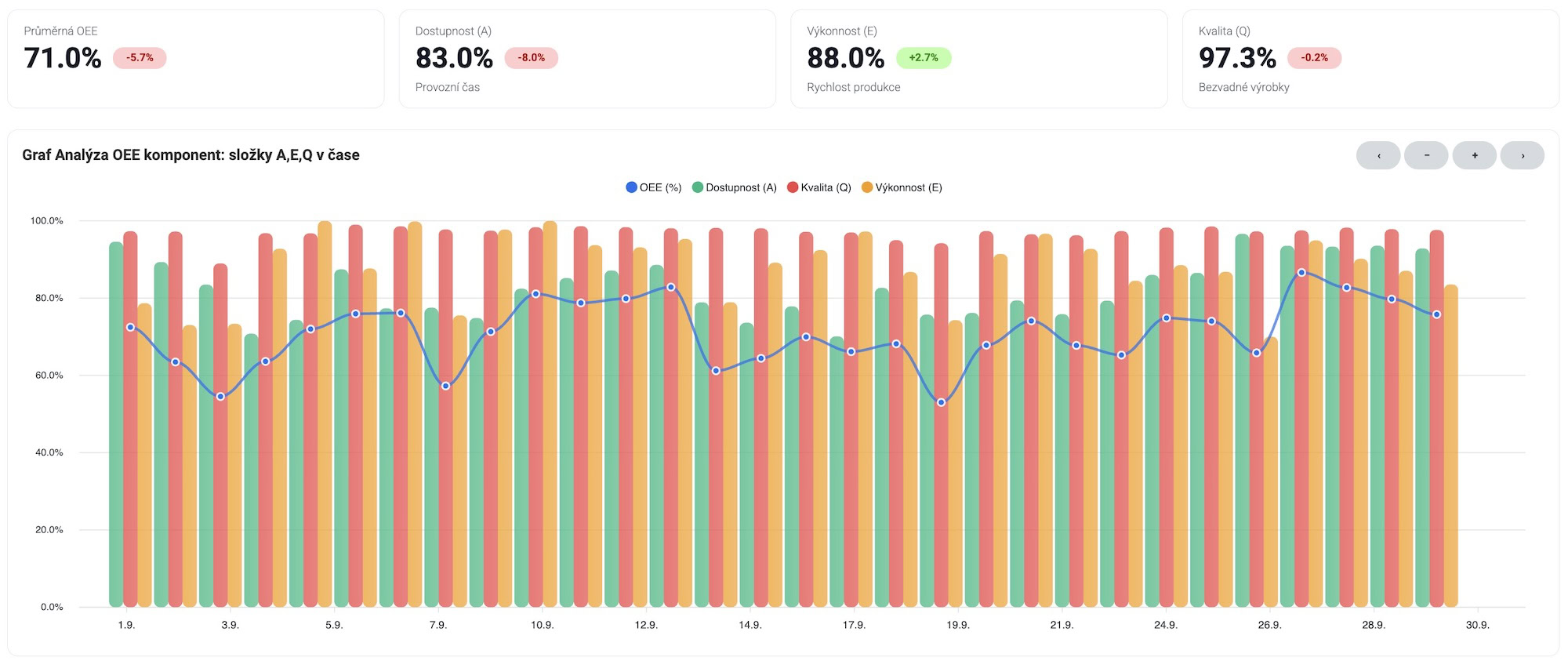
A low OEE on its own says nothing. Splitting it into availability, performance and quality shows whether you are stopping, running slow or scrapping, and a ranking of workstations against target says where to start. It saves weeks of guessing where to put people.
OEE MetricsYou learn when production works and when it does not
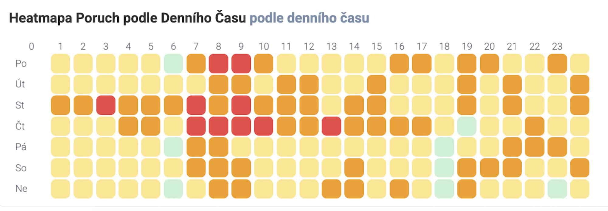
Average daily output, performance consistency and a day-by-hour heatmap reveal that the Monday morning shift loses ground long-term, or that ramp-up drags after breaks. Those are cheap improvements no one finds without data.
Production analysisYou stop promising deadlines blindly
You see how often and by how much reality diverges from the plan, which shifts and lines hold the plan and where it slips. Sales then gets a basis to give the customer a realistic date.
Plan fulfilmentMaintenance stops firefighting and starts preventing
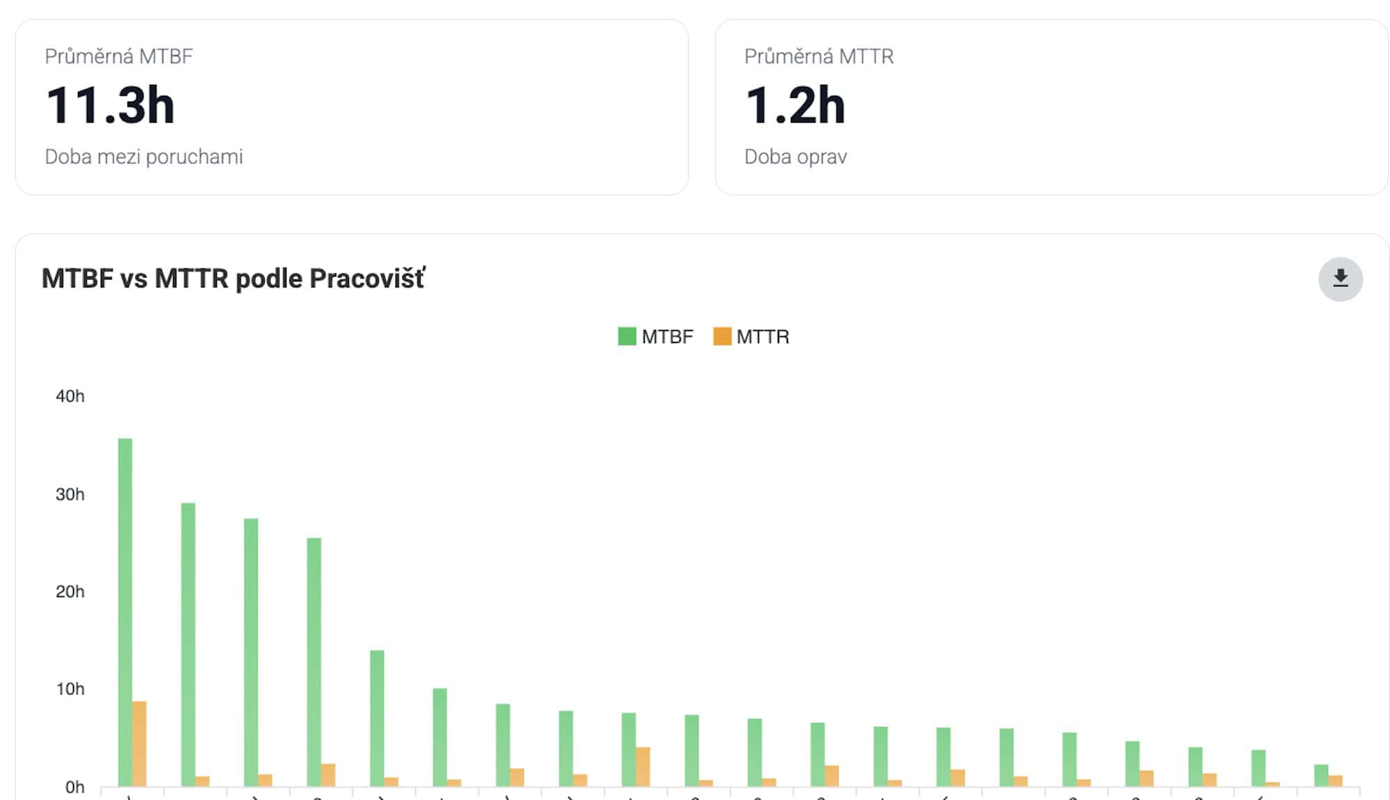
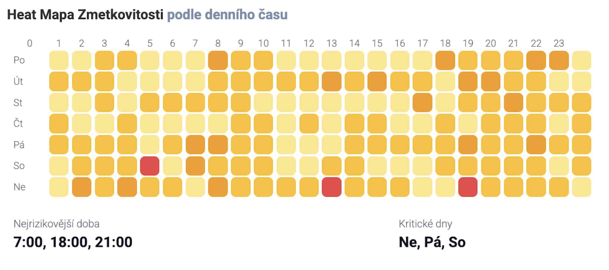
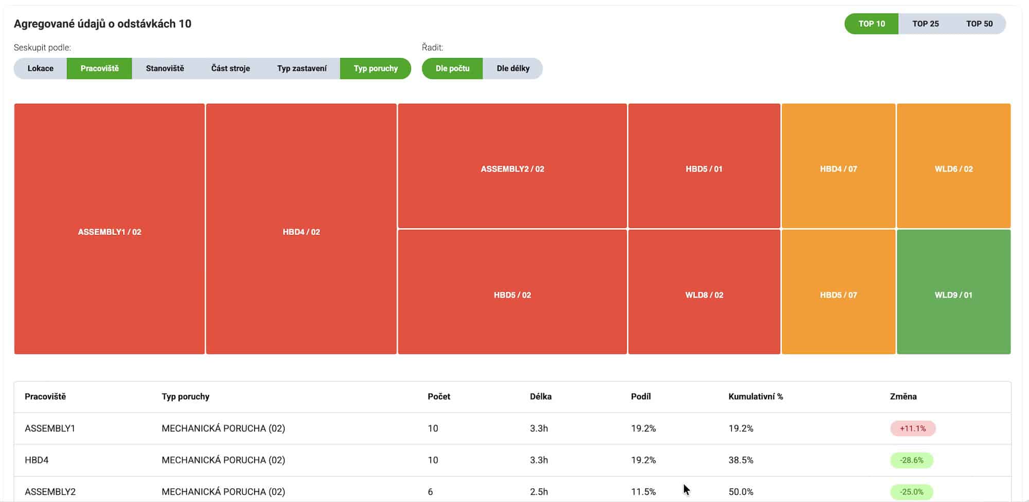
MTBF and MTTR by workstation, fault heatmaps by day and hour and rankings of the most frequent faults show which machine and which of its parts eats up the most hours. You then plan preventive work where it pays off.
Faults & MaintenanceScrap gets an address and a price
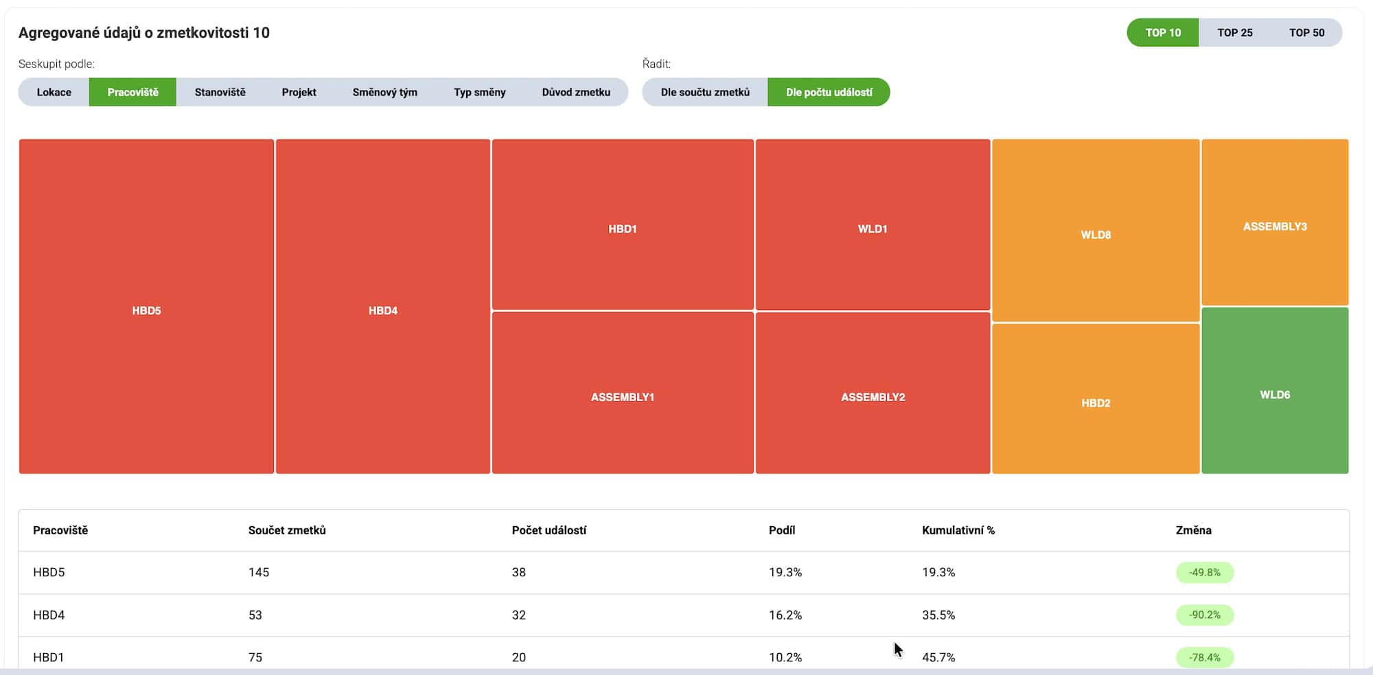
You see which workstation, shift and reason are behind most of the scrap, when it arises and what it costs in money. The quality debate shifts from impressions to the order in which it is worth solving.
Workstation scrapYou see how much material reaches the end flawless
The quality of individual workstations looks fine until you add it up across the whole route. A cumulative view over process stages shows the real yield of the process and which stage drags it down.
Process scrapLosses in money, not in feelings
Downtime, lost profit, scrap and rework converted into money, with the most expensive day, recurring problems and an estimate of savings from fixing the five biggest. That makes the case for improvement easier than percentages of OEE.
Financial impactYou prove you really are improving
OEE trend, the gap to your own target and to world class, performance stability and the ranking of workstations by target fulfilment. You show customers and management the development over time, not one good month.
Trends & PerformanceWhat the data looks like in practice
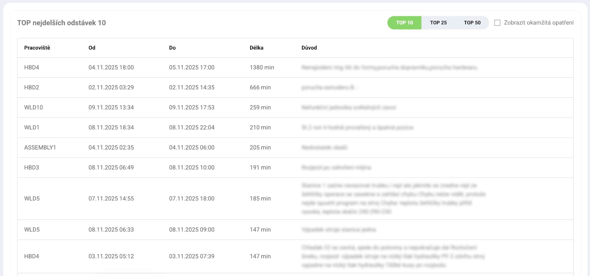
From fault heatmaps to Pareto stoppage aggregations: every dashboard below is a real screen of the module over production data.
Numbers no one trusts cannot be governed
The fastest way to kill an improvement project is a meeting that argues about whether a number is valid instead of about the fix. Analytics is built so that this debate ends right at the start.
- Delta vs previous period on every KPI: the absolute number tells the state, the delta tells the direction. Period and filters apply across all tabs at once.
- Tooltip with the calculation basis: KPI tiles show which OK/NOK parts, minutes and number of shifts the value came from.
- Missing standards panel (Cycle Time): without a takt standard, performance and full OEE cannot be computed, so the module lists the affected workstations itself.
- Honesty about money: for scrap costs the module states for what share of records a unit price was available. Without prices and rates the financial view is openly indicative only.
- Charts with zoom and granularity of days / weeks / months; saved filters, private and public, for repeated analyses like "Press shop · this month".
Which problems keep coming back? The AI finds out on its own.
Charts show where you stop the most. Problem analytics goes a step further: it compares the content of fault reports and action plans, groups semantically similar records into recurring problems, names each one, summarises the root cause and adds up the lost time.
- Same problem, different words: a torn conveyor belt and a cracked belt on the conveyor are the same problem to the AI. Manual matching by a defect code list would miss it.
- Recurrence, not a one-off: an event counts as a recurring problem only once it has occurred repeatedly on different production days. Multiple occurrences within one day count as one, and you set the threshold to fit your operation.
- Two tabs, two sources: Problem reports work with closed fault and failure reports that have both a problem description and a repair description filled in. Action plans reveal plans repeatedly opened for the same root cause.
- Distinction by workstation: the same defect on two lines shows by default as two separate problems, so operations with a different cause do not merge.
- Multilingual output: names and summaries are translated into the user's language, so a Czech foreman and a Korean quality manager read the same thing.
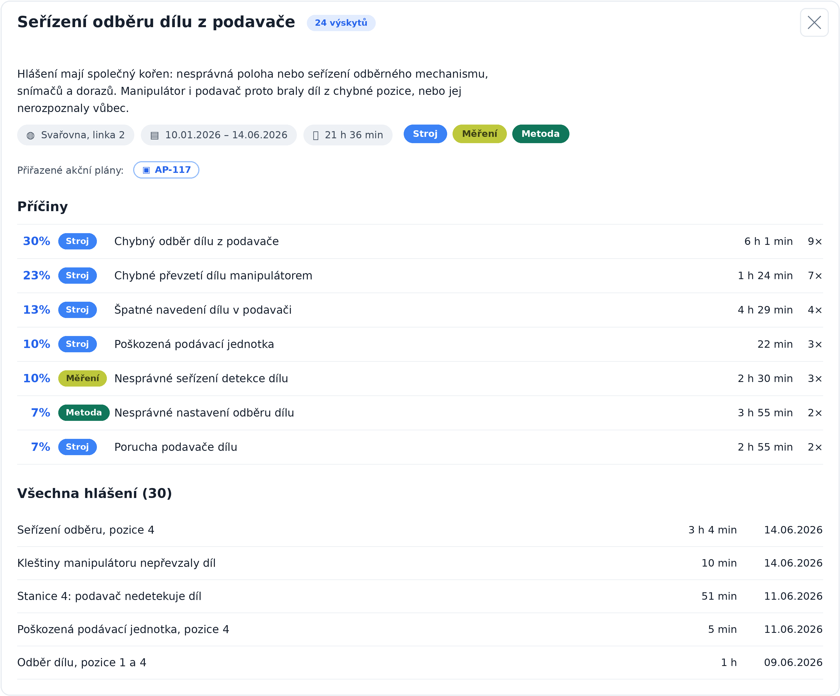
From thousands of reports to named problems
The AI reads the descriptions of reports and action plans, groups the ones describing the same problem, and names and summarises each group. You trigger the recalculation manually with the Find recurring problems button, and the results are saved.
Cause breakdown by Ishikawa
Every problem breaks down into sub-causes with a share in percent, a count of occurrences and a sum of downtime. Colour-coded 6M category labels show where the problem arises: Man, Machine, Method, Material, Measurement, Environment.
Quantified impact in downtime
Lost time is summed for the problem and for each of its causes. Sorting by total downtime brings up the problems that cost the most hours, regardless of which is the loudest.
Methodology score 0 to 100
The AI rates every action plan against eight PDCA steps, from defining the problem to verifying effectiveness. A recurring problem with low-scoring plans is a strong signal that the root cause was not resolved. The score is an indicative measure, not audit evidence.
Link to action plans
The problem card shows the action plans tied to individual reports. At a glance you see whether the problem is already being solved, and one click opens the plan detail.
Filters and share by link
Period, location and workstation, occurrence count, cause category. On the Problem reports tab, filters, sorting and page are written into the URL, so you send a colleague a specific view by link.
What each role gets out of it
Owns line performance
- OEE broken down into availability, performance and quality by workstation
- Plan fulfilment, best and worst shifts, a day-by-hour heatmap
- From a problem item straight to an action plan with a deadline
Looks for where it stops
- MTBF and MTTR by workstation and fault heatmaps by day and hour
- Top 10 faults and machine parts with cumulative share
- The longest stoppages with the crew's immediate measures
Picks what to solve first
- Recurring problems named and quantified in hours
- Cause breakdown by Ishikawa 6M across workstations
- A methodology score shows where an action plan merely patched the problem
Decides by trends and money
- Downtime and scrap costs, the most expensive days and savings potential
- The gap to your own target and to world class, and performance stability
- A ranking of workstations by OEE target fulfilment, computed the same everywhere
Frequently asked questions
From shift reporting (OK/NOK parts, times, plan), from problem and stoppage reports (durations, fault types, repair costs), from planned maintenance stops and from Cycle Time standards. Nothing is entered twice: the quality of the analytics matches the quality of the data on the floor.
Most often because of the definition of available time and the standards. Here the rule is: available time X = shift time minus planned stops, A = 1 − unplanned downtime / X, E via the ideal takt (Cycle Time), Q = OK / (OK + NOK). Missing or wrong standards make the biggest difference, and the module flags them itself.
Workstation scrap shows how much is scrapped at a specific place and already accounts for cumulation within processes per bills of materials, so it can differ from a plain share of NOK parts. Process scrap goes further and multiplies the quality rates of consecutive technological stages, so you see how much material reaches the end flawless. That view is stricter and, to be credible, needs a period of at least one month and configured technological stages.
They are finished, full-fledged views of the module that are not fixed into the tab bar. Enabling them in your installation is set by the administrator.
Analytics is management analysis over a period: trends, rankings, OEE. Today’s overview and Shift handover are operational views of the current day and shift, with their own menu items and permissions, including financial variants.
By content, not by matching words or defect codes. A torn conveyor belt and a cracked belt on the conveyor are therefore evaluated as the same problem. On top of that, an event counts as a recurring problem only once it has occurred repeatedly on different production days; you set the threshold to fit your operation, so one-off events do not create noise.
No, it has no separate module licence; the pages are protected by the tenant licence. Access is governed by two separate permissions in the Analytics category, one for viewing and one for running the recalculation, and above them a main company-wide Enable AI switch. Without it, users see the saved results of the last recalculation.
Analytics lives on data from the Production management module (shifts, reports, standards) and maintenance. It is licensed separately, requires the Analytics permission and runs online only, because it computes large aggregations over live data.
You will see it on your own data, not on a demo
Book a no-obligation online demo. We will set a filter on your workstations, walk through OEE with the calculation basis, find the most expensive recurring problem and open an action plan straight from it. In an hour you will know what today’s blind spots are costing you.
Analytics covers production and maintenance. Analytics tied to other agendas live directly in the respective modules, where their data arises: